
Quick Tutorial for the Census Program Data Viewer
In this tutorial, we will show you how to do many interesting things with the Census Program Data Viewer (CPDV) dashboard, by leading you through a typical scenario. In this scenario, you will find a place in Canada you are interested in, choose what statistical data you want to see and look at the different ways the information is presented on the CPDV dashboard.
When the CPDV first loads, you will see a thematic map of Canada, showing population percent change from 2011 to 2016 for the provinces and territories. On the left hand side is an information panel containing information about the geographic focus and the selected indicator. (By default, these are Canada and population change, respectively.) The panel is updated with different information according to the geographic focus and the selected indicator. At the bottom of the information panel are some tabs that provide further information (e.g., the map legend). Below the map are two charts showing different types of information that we will describe in more detail later in this tutorial.
Step 1: Find a place of interest
The first step of the tutorial is to find a place in Canada we are interested in. For this tutorial, we will be looking at census data for Hull, Quebec.
What to do
- Click the “I want to…” menu button over the map.

- Choose “Find a place” from the dropdown menu.
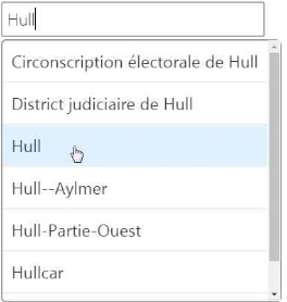
- Type “Hull” in the place name entry box.
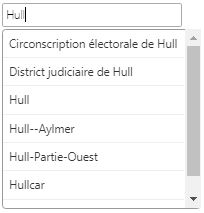
- Select “Hull” from the list of suggestions shown. (Technically this is optional, since you have already typed the whole name, but it is a good practice.)
- Click the “Search” button.

- Click the option for “Hull [Place] in: Gatineau, Ville (Que.).”
![This image represents a list of areas with the word “Hull” in them. Hull [Place] in: Gatineau, Ville (Que.) is selected.](./images/English/F7_E.jpg)
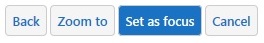
- Click the “Set as Focus” button.
Alternatively, this can be done by selecting a geographic area on the map.
- Find the location you are interested in on the map. Do this by zooming in or out and panning around the map and by using the “I want…” menu button to set the appropriate geographic level for the area you are interested in.
- Click within the boundaries of the desired geographic area.
- Click “Set as focus of analysis” from the map tip that appears.
![This image represents Gatineau, V [CSD] (Que.), the number 4 and the option to set as focus of analysis.](./images/English/F9_E.jpg)
What you see
Your map will zoom in on Gatineau, Quebec, which is across the river from Ottawa.
You will see some information in the panel to the left of the map, and the charts below the map will refresh after a moment. We will look at these shortly.
You will also see a yellow highlighted border on your map. It identifies the boundary of the Gatineau census subdivision. The area inside this yellow border is what all the census data are tied to. That said, let’s choose what type of census data we want to look at. In CPDV terms, a type of census data that is tied to a geographic area is called an “indicator.”
Step 2: Select an indicator
As we have seen, “indicator” is the name for a type of census data that is tied to a geographic boundary (or place). In this step, we will choose an indicator from the library of census data available in the CPDV.
What to do
- Click the “I want to…” menu button over the map.

- Choose “Select an indicator” from the dropdown menu.
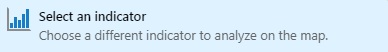
- Select the “Age and Sex” category from the list provided.

- Select the indicator “Census Subdivision – Average age.”

What you see
After you click the “Census Subdivision – Average age” indicator, your map will refresh to show Gatineau and all the surrounding census subdivisions, coloured based on the average age of the people living there. The information panel to the left of the map now shows summary information related to the “Average age” indicator, including how the Gatineau census subdivision compares with other areas in Canada and Quebec. Take a look at the data in the summary panel and see what they are telling you—this is one of the easiest ways to gain insight from your CPDV dashboard.
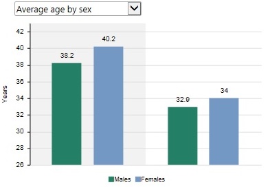
Statistics Canada has preselected some potentially useful data related in some way to the “Average age” indicator. These data are now shown in the chart on the right, below the map. For the “Average age” indicator, you can choose from a couple of different related charts using the dropdown chart selector. We will return to this in a bit more detail later in the tutorial.
The chart on the left below the map has refreshed to show the average age for all the census subdivisions in Canada. Since there are so many census subdivisions in Canada (over 5,000), each individual census subdivision cannot be shown. Therefore, your CPDV dashboard presents a generalized area chart instead. Notice that the colours in the chart match the colours in the map—this lets you make correlations between the two more easily.
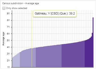
The vertical yellow bar on the chart shows where the Gatineau census subdivision (your “geographic focus of analysis”) fits into the overall national picture. You can get a more detailed view by clicking a bar in the chart.
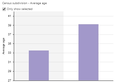
Looking again at the chart on the left side, notice the checkbox labelled “Only show selected.” If you check that box, the chart will refresh to show only the value for the Gatineau census subdivision.
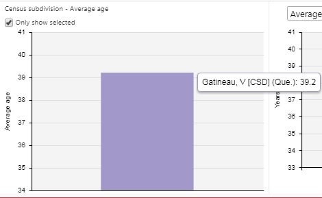
With only one census subdivision selected, this chart is not very useful. Let’s see how we can make better use of it in the next step.
Step 3: Compare other areas
Your CPDV dashboard allows you to look at more than one place at once, so you can see how they compare with one another.
What to do
Once again, there are two ways to do this. You can either select areas interactively on the map, or go through the “I want to…” button to the menu and select “Compare with another location.”
- Click the “I want to…” menu button over the map.

- Choose “Compare with another location” from the dropdown menu.
- Type “Grande Prairie” in the place name entry box.
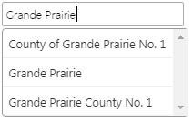
- Select “Grande Prairie” from the list of suggestions shown.
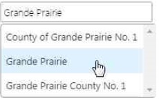
- Click the “Search” button.

- Click the option for “Grande Prairie, City [Census Subdivision] (Alta.).”
![This image represents a list of areas with the words “Grand Prairie” in them. Grande Prairie, City [Census Subdivision] (Alta.) is selected.](./images/English/F22_E.jpg)
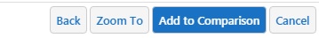
- Click the “Add to Comparison” button.
What you see
![This image represents the selected comparison geography which is Grande Prairie, CY [CSD] (Alta.) = 32. Two small icons appear on the right of the comparison geography. The first icon enables the user to remove the geography. The second one enables the user to modify the geography.](./images/English/F24_E.jpg)
Step 4: Review data
You can access the data underlying all the maps and charts seen on your CPDV dashboard.
What to do
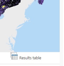
- Click the “Results table” button, which is near the chart selector above the chart on the right side. The picture below shows where the button is in relation to the map so you can find it more easily.
What you see
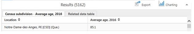
After you click the “Results table” button, the data are shown in tabular format underneath the map, where the charts used to be. There are two sets of data: one showing the average age of all census subdivisions in Canada, and another with related data. You can switch between them using the tabs at the top of the data table.

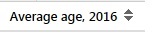
The average age data table orders the census subdivisions from oldest average age to youngest. You can change that by clicking the “Average age” column header. In fact, you can sort any of the columns in any of the tables by clicking the column header.
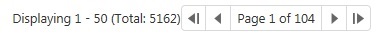
There are many census subdivisions in Canada, and your CPDV dashboard will show you 50 of them at a time. You can flip through the different pages of results using the controls below the data table. They let you jump to the first page or to the last page, or go through each of the pages individually.
If you click one of the names, the map will automatically zoom in on that place.
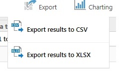
If you want, you can export these data in either CSV or XLSX format.
What to do
- Click the “Export” button.
- Select the export format in which you would like to download.
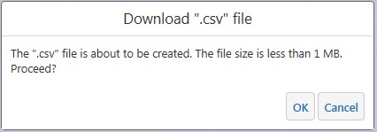
- You will be asked to confirm that you wish to proceed. If you select OK, the download process will begin.
Step 5: Explore related data
You can gain further insight into the data, and potentially identify relationships between the main indicator and other indicators, by using the related charts (in bottom right-hand corner). Let’s continue from the example above.
What to do
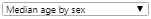
- Click the dropdown menu in the top left hand corner of the chart to see what other related information is available for your selected indicator. In this case, choose “Median Age by Sex.”
What you see
The chart will be updated to show new information.
Step 6: Export or share your dashboard
The final step in this quick tutorial is exporting your dashboard. You can either save selected elements or share with others, as a link, the customized dashboard you created.
What to do
- Click the “I want to…” menu button over the map.

- Choose either “Export dashboard elements” or “Share this dashboard” and follow the instructions that appear.
This tutorial led you through a few of the most commonly used tools in your CPDV dashboard. We encourage you to explore the other data and places available in the CPDV.
- Date modified: